- Paperboy
- Posts
- Steal These BFCM Sections 🥷🏼
Steal These BFCM Sections 🥷🏼
Your customers will love you
Fil from Bedford
October 17, 2025 • Reading time: 2 minutes
GM! Paperboy here 🗞️
For those of you looking to add personality/fun to your brand, check out some of Shinesty’s emails (partially NSFW). They do a great job of blending disruptive creative, product visuals, on-brand copy and other funny elements.
From my swipe files: BFCM sections
Forward this email to your copywriter & share the inspo with your designer. I’ll share the TLDR at the end.
#1 - Rebecca Minkoff $x & under - great for gifting cohorts.

#2 - Free People featured collection footer - if people don’t want the products in the email, help them navigate to products they do want.

#3 - Drunk Elephant clear CTA - this seems so obvious but make sure your CTA contrasts, and is super easy to find. The end of an email should tie back to the main CTA or a collection section (see #2). We’ve run AB tests for brands that don’t want to put CTAs and the variants without CTAs always lose.

#4 - Homesick sale banners - another obvious one, make your sale banners stupid simple to understand. Less time reading copy, more time shopping.

#5 - Cadets easy-to-scroll gift guides - make your gift guides fun & easy to skim. This email squeezes in 30+ products without feeling overwhelming.

#6 - MATE the Label lead with text - strikes a great balance of feeling personal, but then layering on lifestyle/brand. Personally I would have made the copy a little more concise and tied the benefits into the CTA (e.g. Shop 30% Off Activewear → 30% Off Organic Activewear)

#7 - Five signal badges - a great way to signal trust, offers, savings, discount codes and more without cluttering your email.

#8 - Jupiter countdown timers - I see so few brands use this because ✨brand💃🏼. AB test it now, thank me later. Need more convincing? Sephora, Ridge & Pela Case.

#9 - Brez gift card capture - win customers who already finished shopping. **Big brands only - don’t waste your time sub $5-10 mil.

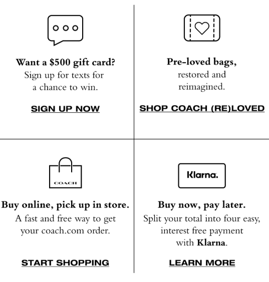
#10 - Coach footer objection icons - make it easy to dispel any fears before the click.
TLDR - Make it simple to shop
Emails should be easy to skim
Products (especially new) on full display
Sales very clear to understand
Clear CTAs at the start and the end of emails
Address core objections (shipping, returns, etc.) in footers/mini sections
Give people an out if they don’t like the content (collection sections)
Communicate deadlines & urgency
Happy BFCM planning scrambling season.
We’re hiring!
Our agency is on the lookout for account strategists & copywriters. If you like these emails and want to work with us at Bedford, send me a note! We’re 100% remote!
Meme of the Week

That’s all for now,
Paperboy 🗞
p.s. Did you like the newsletter? Hate it? Reply and tell me why! I read and reply to every message.
AfterSell - Upsells that drive AOV without hurting CVRs
I use AfterSell with 7 and 8-figure brands at my agency. I would never promote a product I don’t personally use.